Mary Meeker puts out a set of trends on the internet every year and I thought why not do one for sustainability and climate change. Here is the start to Weber’s Clean tech slides…These are in no particular order, as I update these slides as I come across new and interesting ones.
What di I define as the sustainability and climate change sector. Here are some broad thematic areas
- Transition to a low carbon sustainable economy
- Growth of the clean technology sector (opportunities, stock exchanges, companies, jobs…)
- Carbon pricing and businesses and sectors that are internalizing or developing business models where all costs are incorporated
- Resource efficiency and the development of a circular economy
I will add more as I become aware of them.
Slide 5 (March 4, 2016)
This slide shown which I took from here and they aggregated from somewhere else. What is shows is the bidding by companies to provide solar electricity, the latest bid in the state of California is less than 4 cents per kwh for a 25 years of electricity. There are some subsidies included in this – in the US, the renewable energy tax credit and there is lots of discussion in the comments about the amount of the subsidy based and when the power is supposed to be delivered.

Slide 4 (Feb 24, 2016)
A great slide showing how the efficiencies of various types of solar cells have improved over the years….(from cleantechnica)

Slide 1 – Extent of renewable energy generation in Europe
ENTSO-E’s annual overview of the European electricity market, Electricity in Europe 2014, which has recently been released, testifies to the steady expansion of renewables generation taking place in the EU electricity sector:
33% of electricity produced in the EU now comes from renewables, of which 18.5% is hydropower and 14.4% “other renewables” (mostly wind and solar power). In 2011 hydropower supplied 15.3% and other renewables just 9.3%. The share of fossil fuels has gone down from 48.6% in 2011 to 40.5% in 2014. Nuclear power has remained stable despite the German nuclear phase-out.

Evolution of ENTSO-E net generation
(Source: ENTSO-E)
Another interesting chart on energy efficiency and economic growth is posted here discussing how electricity sector is going to change over the next few years.
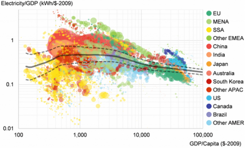
Slide 2: The comparison between economic growth and energy efficiency.
What I love is the following chart showing links between economic growth and energy efficiency:
Each color represents a country or region. As economies get richer, growth requires less power.It is difficult to really analyse underlying trends in this chart. As can be seen, even Canada is becoming more energy efficient as its GDP per capita increases.
A better higher resolution graphic is at Bloomberg New Energy Finance somewhere at the BNEF new energy outlook. I could not find it. It may be available only for subscribers.
Slide 3 (July 3, 2015):
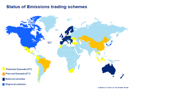
One of the most common images that are being used to characterize the rise of carbon pricing, whether it be cap and trade and/or carbon tax is one which shows the number of countries with some form of carbon pricing.
Here is a map of the status of emission trading systems that I created for a client in 2011-12. Here, the light blue color indicates no emission trading systems and yellow and orange are planned systems.
The following map is from some analysis done by the World Bank in 2015 with carbon markets now valued at 50 billion, much of the yellow and orange now being implemented and with additional countries now planning carbon pricing.


